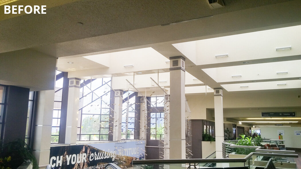
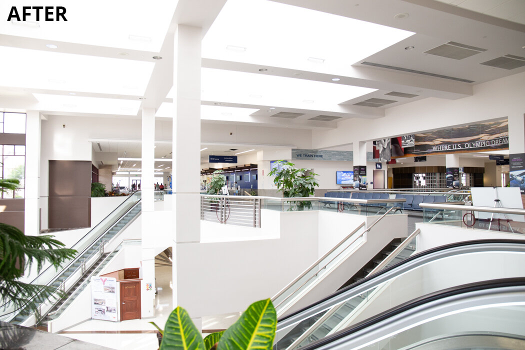
The original Colorado Springs Airport terminal was completed in the mid-90s. Since then technology, airport services, security needs, and aesthetics have changed dramatically.
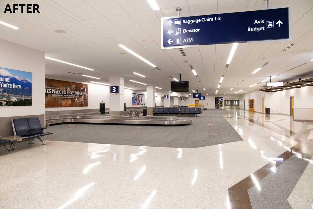
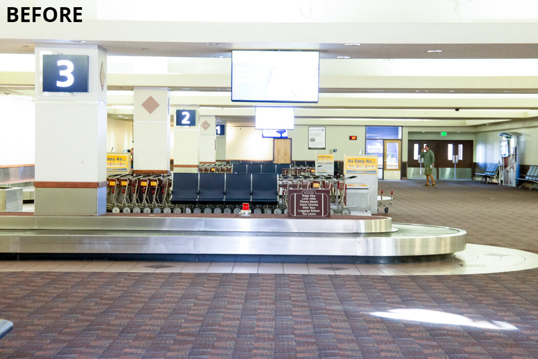
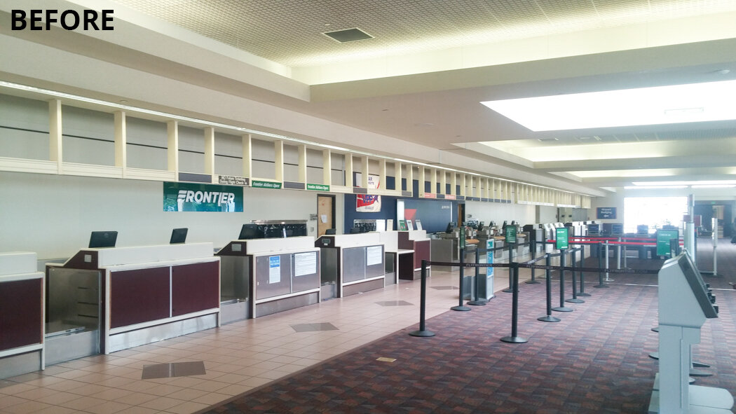
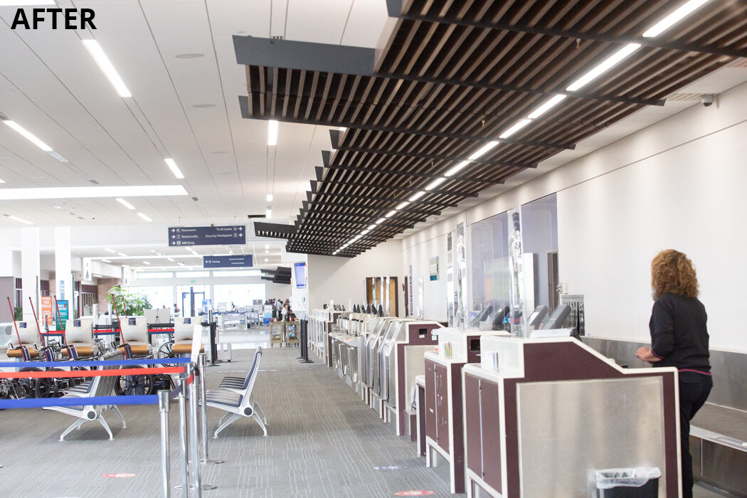
Our design updated the public area of the main terminal building from the tunnel entrance through baggage claim and ticketing up to the start of the security checkpoint. Upgrades included new LED lights, new and lightened interior details like white Terrazzo, new carpet, simplified columns, ceiling details, and new furniture throughout. Other important goals of the modernization were to bring the terminal into full ADA compliance and to improve way-finding for travelers.
The original building was dark with seemly-low ceilings throughout, even though the ceiling was 12’ high in some areas, large soffits containing mechanical and electrical elements made it seem as though the ceilings were much lower. The new design removed the soffits which gave the appearance of a higher ceiling, even though the ceiling was actually lowered by up to 8” in some areas.
The new LED lighting and design brightened the interior spaces of the building. Lights on the lower level and tunnel were designed to be 20%-30% brighter than lights on the main level. The brighter lights plus the new white paint help reflect natural light into the lower level of the building which in turn made the whole building seem even more spacious.
To bring the building into full ADA compliance HB&A redesigned the bathrooms with new toilet stalls, new fixtures, and accessories.
The new rental counters will be installed soon and we’ll update with more photos when they are done.
HB&A partnered with DWL Architects & Planners, Senger Design Group, Bridgers and Paxton, and Stanton Construction on the Colorado Springs Airport Modernization Project.
To view the “after” photo, click on each “before” photo below.
